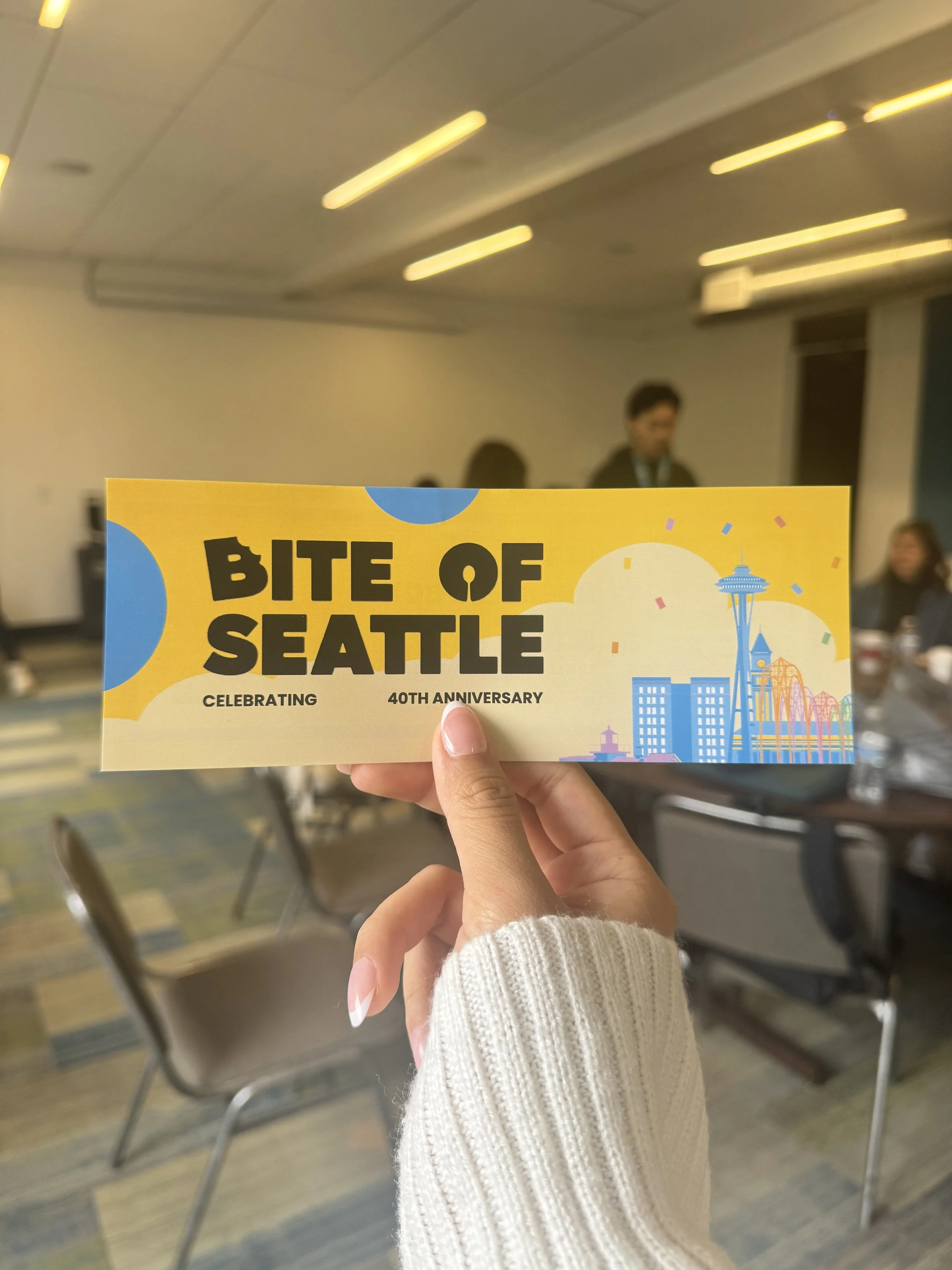
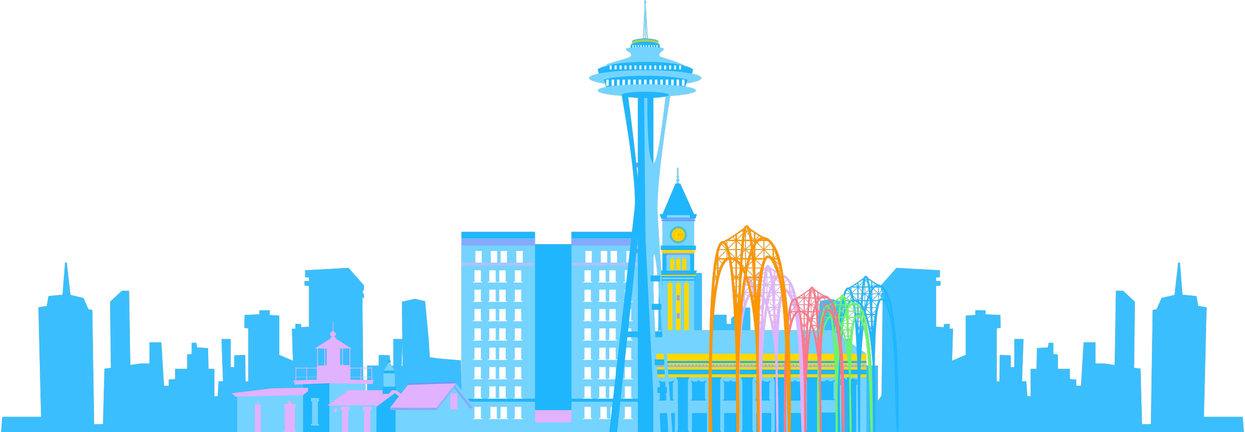
Reimagining a Seattle Tradition: The Bite of Seattle’s 40th Anniversary
CONTEXT & MY ROLE
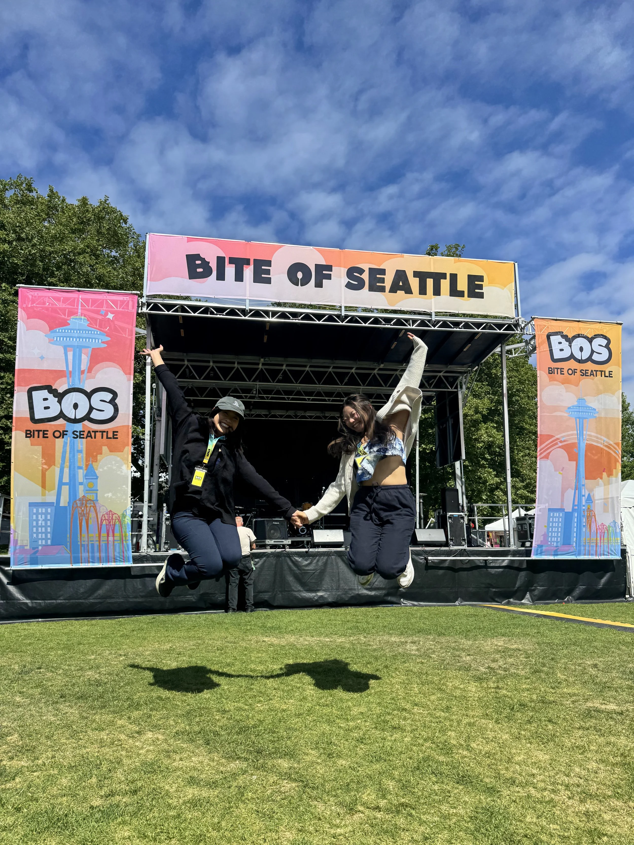
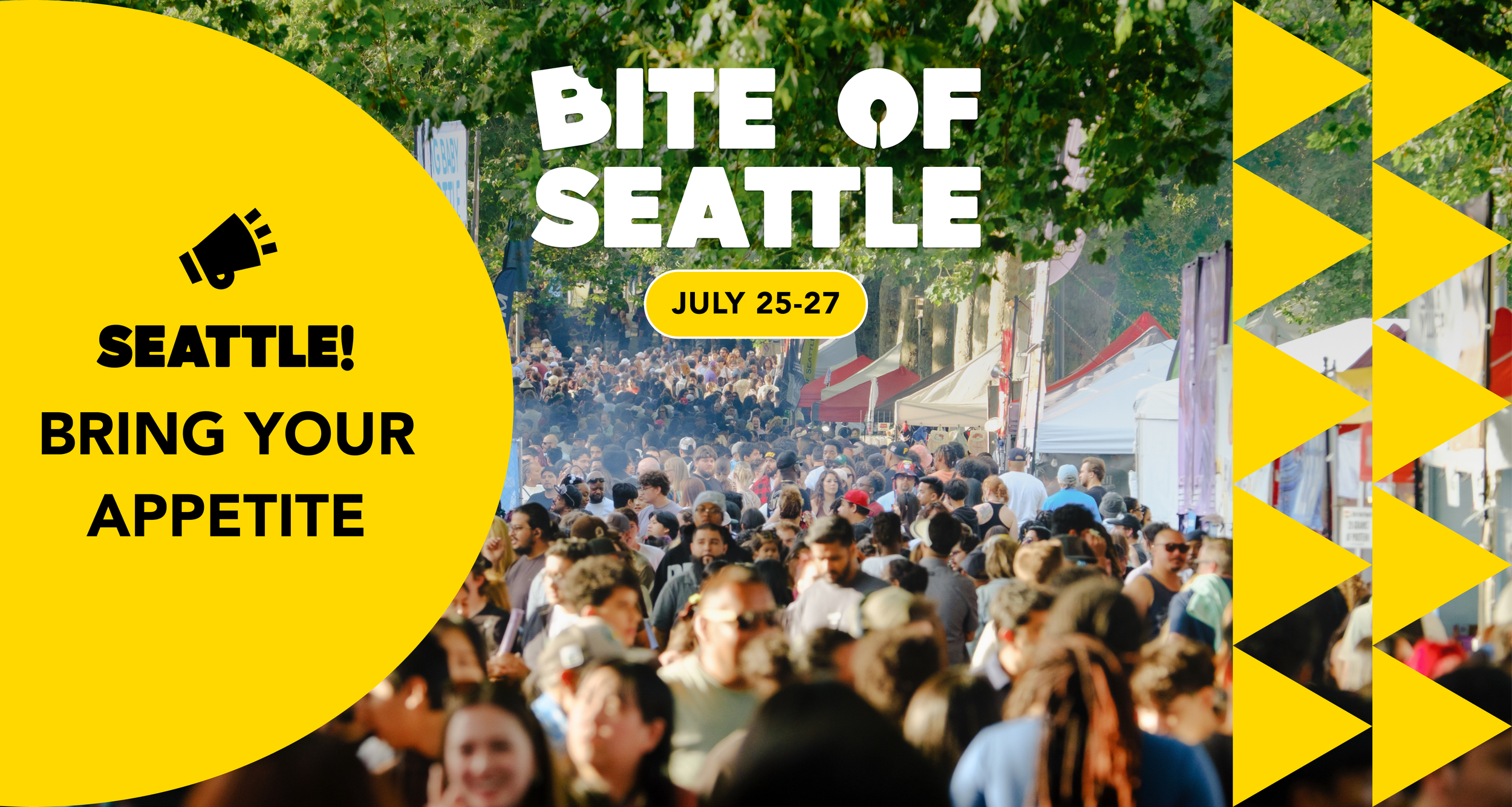
The Bite of Seattle is a long-running summer food festival that celebrates the city’s diverse culinary scene and draws thousands of attendees each year since 1982. For its 40th anniversary, I led the rebrand to modernize an outdated visual identity and reimagine the festival as a bright, fun, and contemporary celebration designed to energize audiences during Seattle’s sunniest season and support increased attendance.
TIMELINE
May 2025 -> Jul 2025
TEAM
Julie Christine / CEO
Kevin Wang / COO
Mindy Tran / Marketing Manager
Matthew Tjokro / Content Manager
Eliana Wu Chen / Creative Designer
Admin Team
TOOLS
Adobe Illustrator
Adobe Photoshop
Figma
KEY RESULTS
Highest Seattle Center Monorail Ridership on record, moving 65K passengers.
Saturday ridership recorded 27K visitors, the busiest day recorded in 15 years.
Total attendance of 250K+ with 152K+ unique visitors.
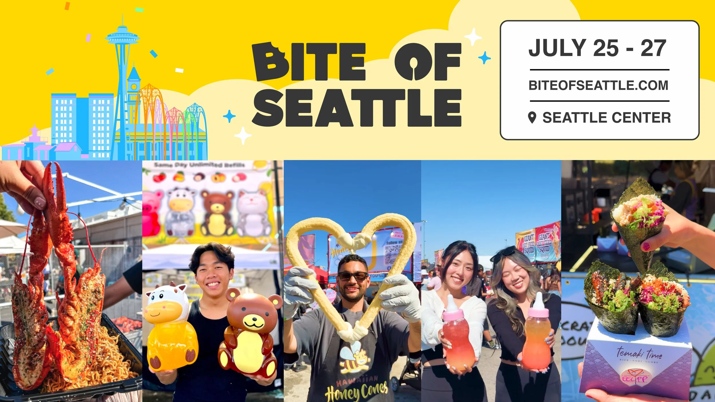
Digital signage in the Seattle Monorail with the highest recorded Bite of Seattle ridership.
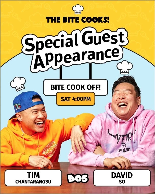
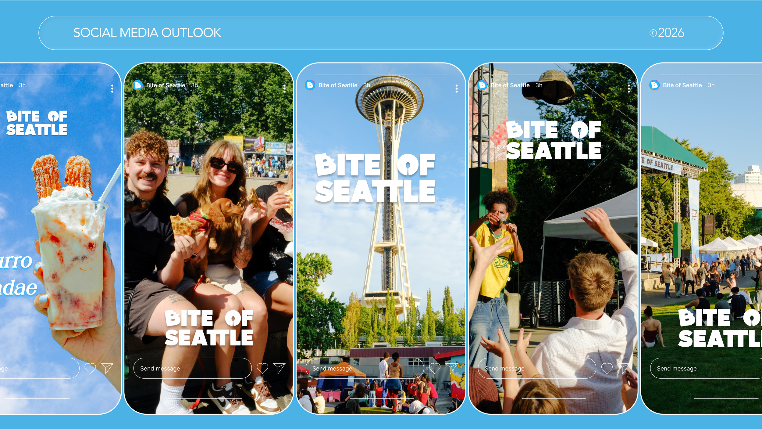
Influencer Guest Digital Graphic
Bite of Seattle’s Food Voucher Graphic
WHY THE REBRAND
The existing brand failed to reflect the scale, energy, or cultural relevance of the event, risking disengagement from both longtime and new audiences.
Following the rapid acquisition of The Bite of Seattle in 2024 and with a compressed timeline, it left the team with minimal opportunity for a long-term brand planning. The brand felt outdated and still strongly associated with the previous ownership.
Brand Ideation Workshop
To kickoff the rebrand, I aligned internal team members and stakeholders on the core challenge: updating an outdated identity under a compressed timeline while preparing for a large-scale public event. We reviewed key visual assets to identity what can be retired and kept.
GUIDED IDEATION & BRAINSTORMING
Rather than an open-ended brainstorming, I led structured ideation exercises focused on:
Brand Attributes (festive, iconic, modern)
Visual Anchors that felt uniquely Seattle (Space Needle)
Color & Tone exploration aligned with the summer energy, celebration, and nature
This approach helped translate abstract goals into more tangible creative direction.
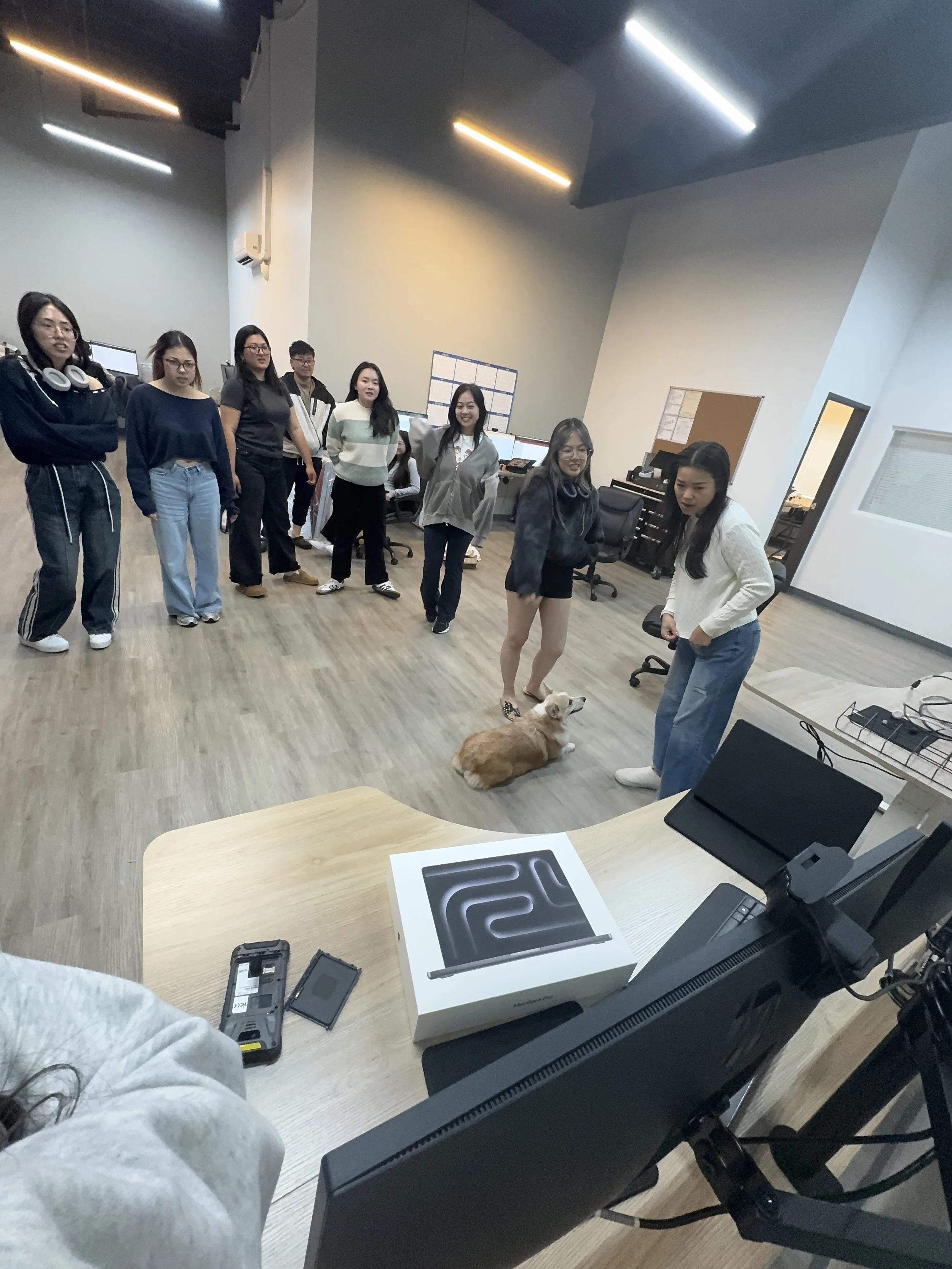
Marketing Team, Admin Team, and CEO (and one very involved office dog 🐶)
BRAND IDENTITY GUIDELINE
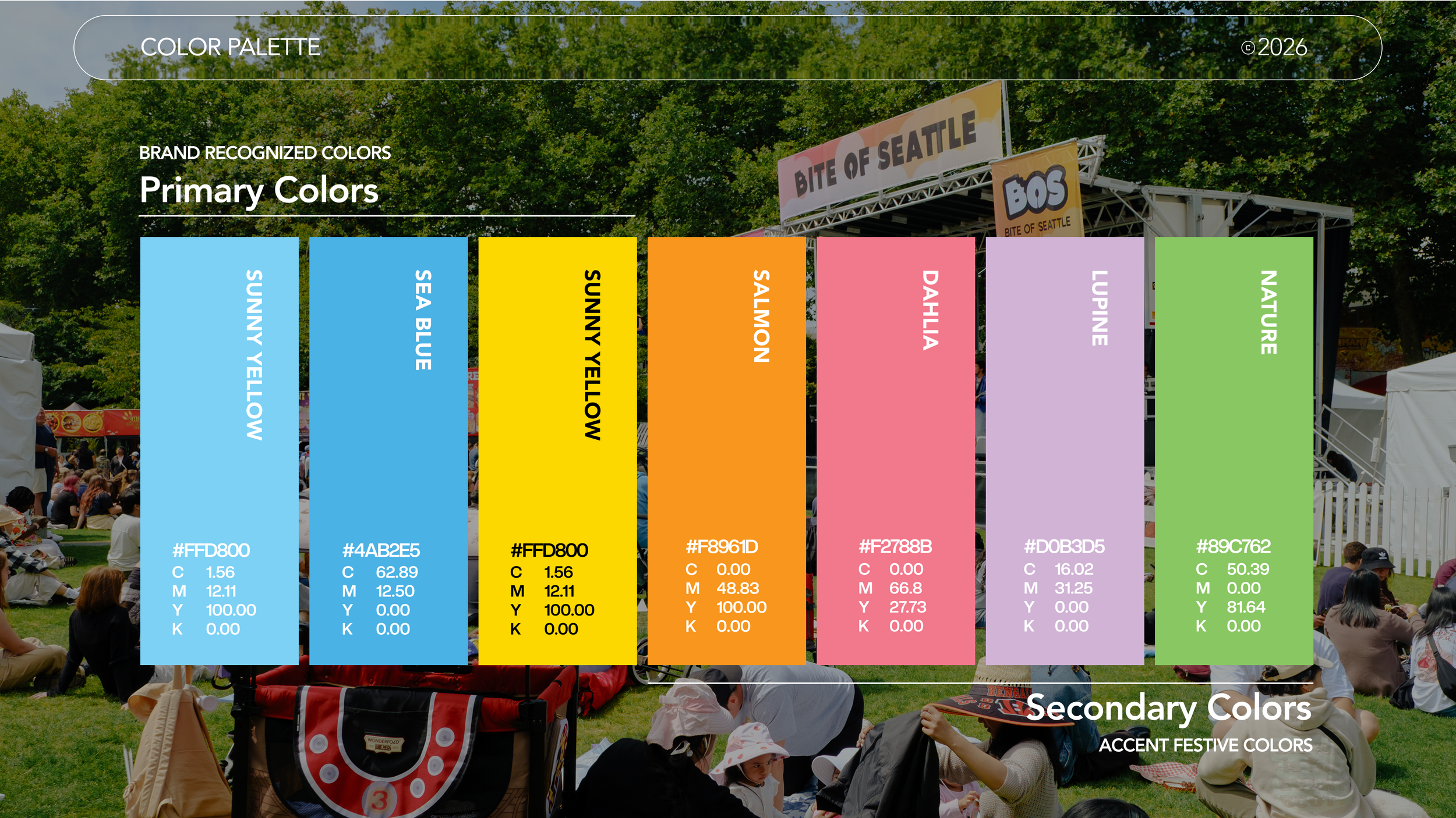
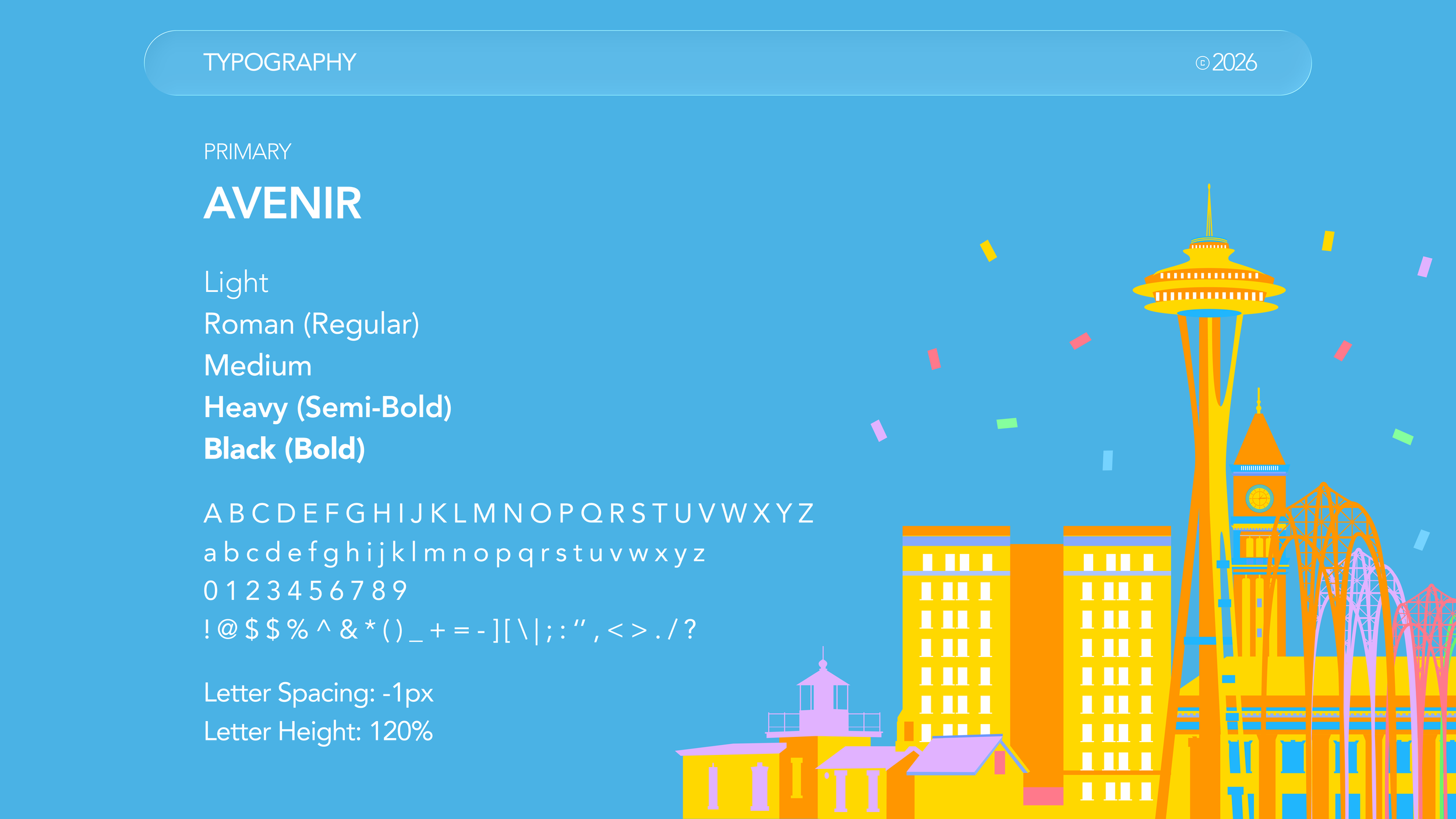
LOGO VARIATIONS
Primary Logo
When to Use:
Horizontal Creatives
Brand Introduction
Secondary Logo
When to Use:
Vertical Creatives
Mobile Constraints
Favicon
When to Use:
Bookmark
Tab Identification
LOGO CONSTRUCTION
Use the letter ‘O’ as ‘X’ as a measurement of the minimum space needed to surround the logo.
O=X
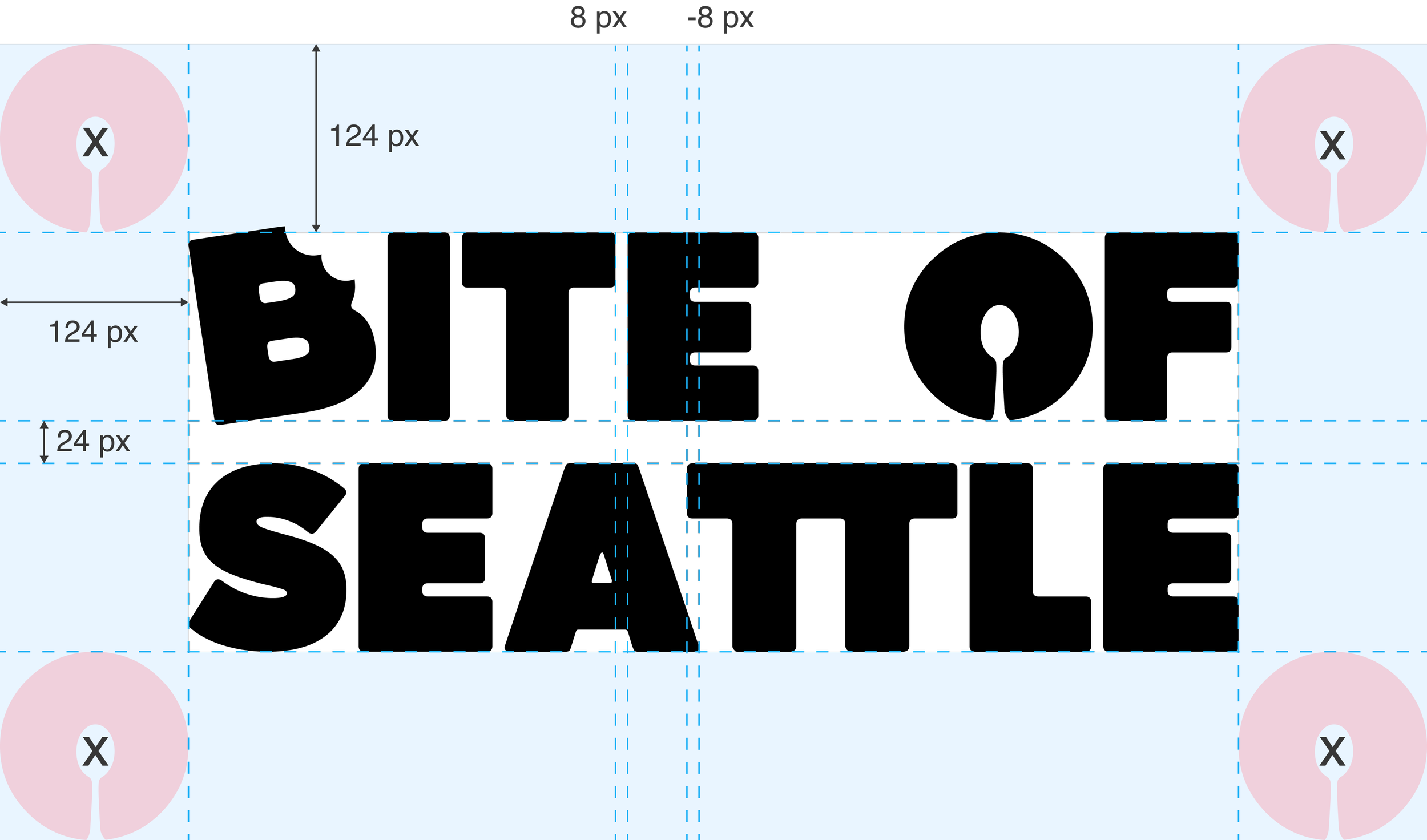
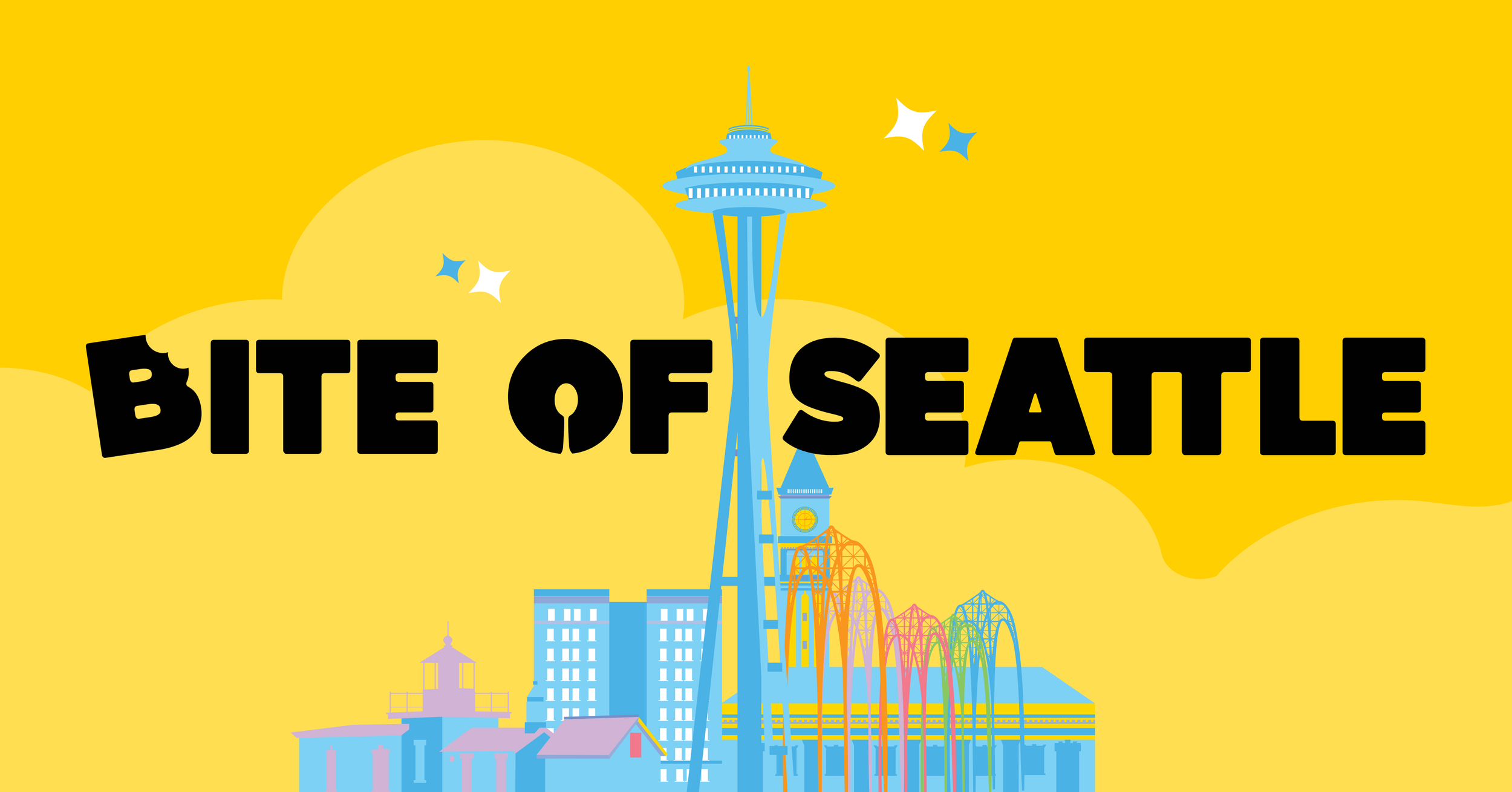
BITE OF SEATTLE
BITE OF SEATTLE
LEARNINGS
🧠 By leading ideation sessions and clearly defining goals and non-negotiables upfront, I was able to align stakeholders across the marketing and admin team on the festival’s direction. This reinforced my strength in leadership and my ability to turn abstract brand ideas into actionable creative direction.
🎯The biggest challenge was navigating a compressed timeline and producing assets with limited opportunities for iteration due to third-party manufacturing logistics. I addressed this by prioritizing high-impact design changes and making intentional tradeoffs rather than aiming for perfection, which allowed the rebrand to move forward without slowing down operations.
🚀 Going forward, I will continue to apply structured facilitation and clear success metrics to help teams move quickly while maintaining clarity.
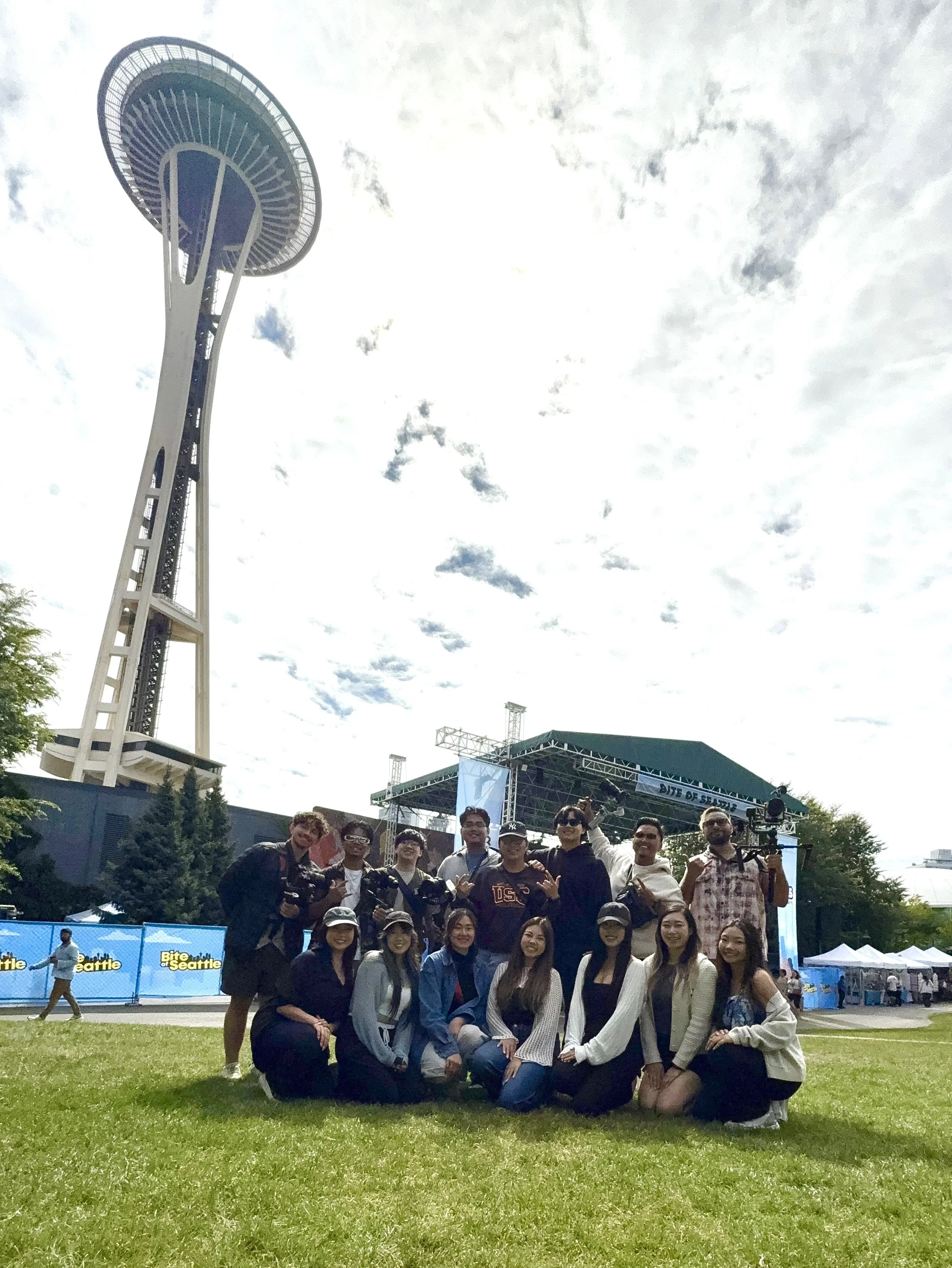
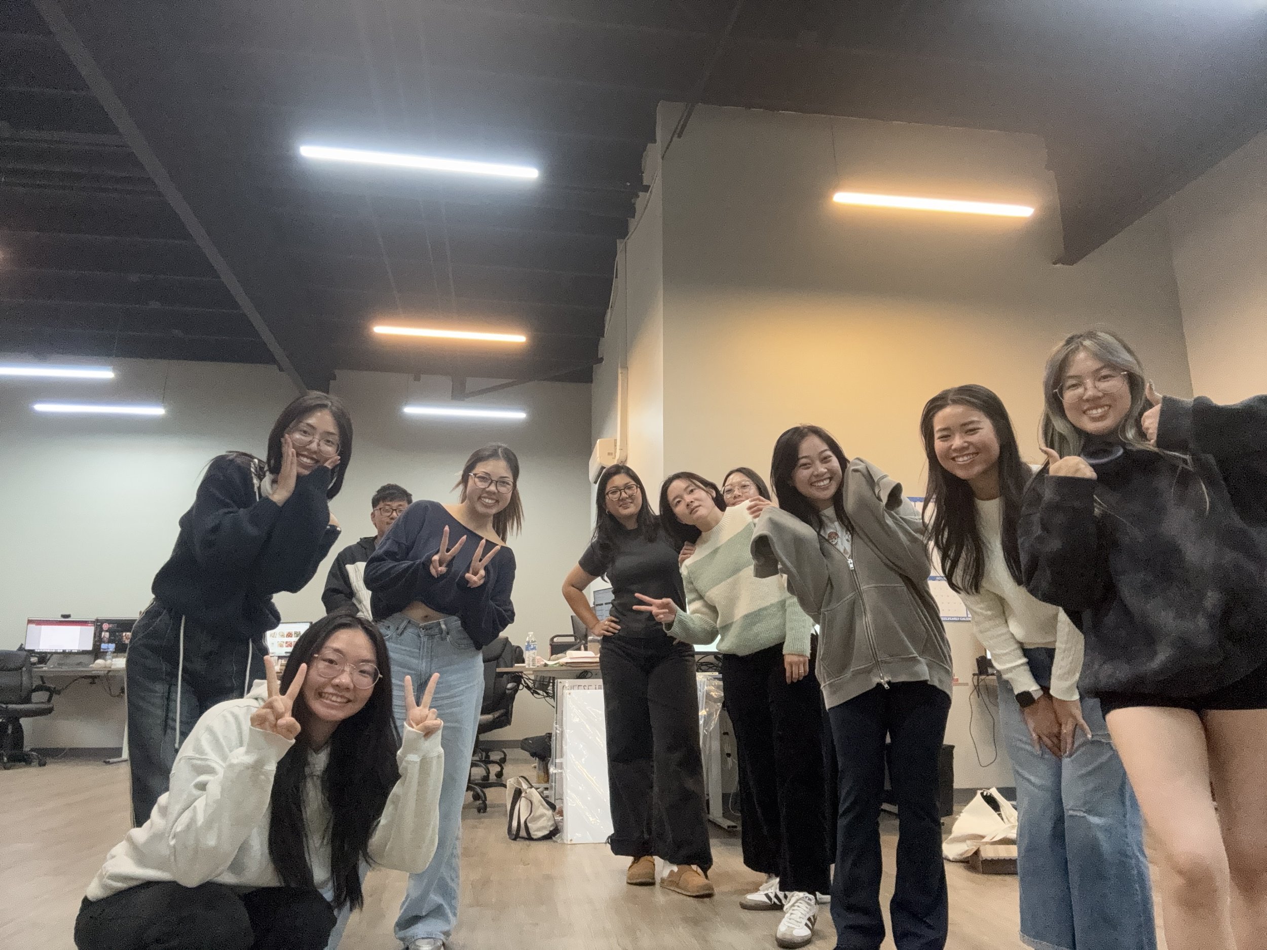
Marketing & Production Team