
Introduction
Memit, otherwise known as Memorize it!, is a flashcard app that sends a daily notification to the user to encourage the user to complete a daily study session (quest) by reviewing an older deck of flashcard for the user’s current courses. Being continuously exposed to course content not only reduces stress but also enhances information retention and cognitive functioning. By creating a balanced study routine, individuals can approach their academic with a calmer demeanor, leading to better overall well-being and academic performance.
Scope
UIUX Designer, UX Researcher
Timeline
1.5 weeks, 100 hours
Tools
Figma, Figjam, Discord
Problem
Students lack motivation and discipline to study.
Many students often find themselves overwhelmed and stressed due to their lack of accountability. Without a strong sense of accountability, they might procrastinate, leading to increased stress levels as exams loom closer. To alleviate this stress, it is crucial for students to develop self-discipline and take ownership of their actions, fostering a sense of responsibility that allows them to effectively manage their academic and personal obligations. But how?

Research
-
We want to know how students can effectively study so that student’s needs are met for maximum learning and performance.
-
What challenges do students face when studying for an exam?
How do students prioritize course materials to study for?
What methods have students incorporated into their study routine that was effective?
How aware and accountable are students before exams?
User research
To better understand student experiences, I interviewed a current med student and 4 recent graduates.
Insight
Once exam looms in, 4/5 participants are aware to study for the exam. Many variants in play this role as well, such as their current grade standing and other courses that are prioritized at a higher degree.
The biggest challenge for the majority of the participants are the lack of preparation due to other obligations that take up their schedules.
Majority of the participants still use pen and paper as participants expressed better retention using this method.
Some participants shared that the key to studying for exams is to observe the professor’s concept emphasis. Otherwise, trying to memorize every concept from page 1 is ineffective and inefficient.
Competitive Analysis
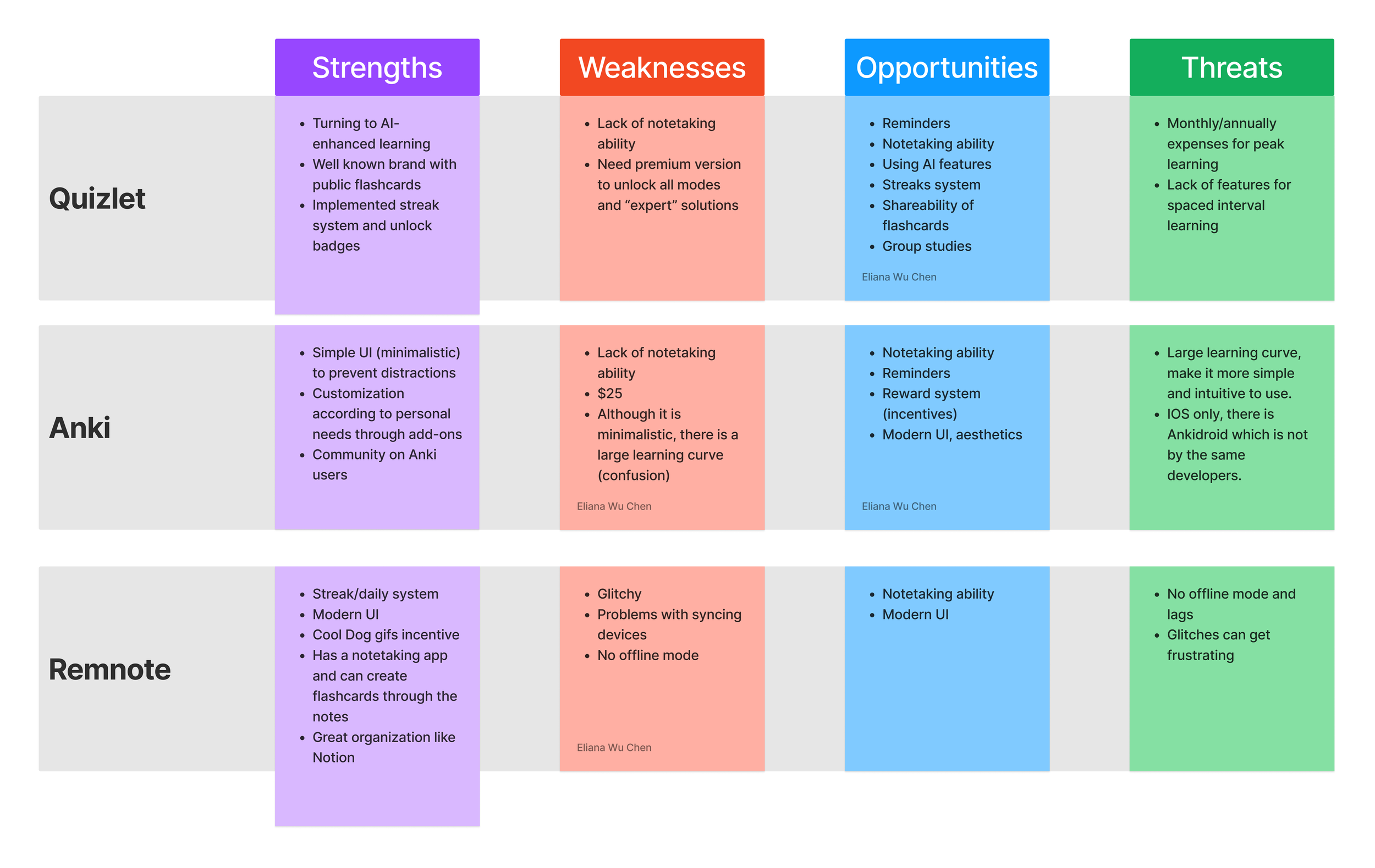
Competitive Analysis Takeaways
All 3 apps provide repetition exercises
Two apps (Anki + Remnote) allow users to gauge their mastery on the material
Two apps (Quizlet + Anki) lack notetaking abilities
Define
Affinity Map
I collected all user interview data and synthesized them into common categories.

Affinity Map Synthesis Debrief
Challenges: Participants expressed they often lack time and balance for their classes due to their lack of preparation while being distracted by other obligations.
Organization: Some participants still prefer keeping a physical copy of their notes. Otherwise, majority of the students tend to keep their digital materials organized on Google drive or Google docs.
Accountability: Participants confessed that their motivation to study depended on their grade status in the class. Therefore, participants prioritized studying for classes where they have a lower standing.
Study method: There were many variations. Some participants relied on PowerPoint slides given by the class. One relied on textbooks. Others relied on online resources such as Remnote and Youtube.
User Persona
I created a user person to help better define our target audience: collegiate students.

HMW’s
After defining our user problems, I generated two “How Might We” statements to align user problem with potential design solutions.

Design

Sitemap
The site map I created for Memit provides a simple run-down of the necessary pages I need to create.
With the sitemap in mind, I created two flow charts that would represent how users would typically experience with the app. One being the onboarding process and second, creating a folder and flashcards.

Flow Chart
Prototyping
Lo-fi Wireframes + Testing
For flow 1, the onboarding process, users were unsure of what to expect and needed more details. “What if I don’t have a fixed schedule?”
This prompted me to provide a skip button and users can come back to edit their schedule whenever they want.
For flow 2, users were unsure of the difference between the navigation menu and the profile page.
To further differentiate the difference without losing track of the task flow, I decided to add a page for the navigation menu.

HI-FI Protoype + Testing
Participants mentioned the need for account creation skip-ability since there is not a considerable amount of sensitive information within the app. Moreover, it would drive away potential users for those scoping the feel of the app.
The difference in image styles were confusing. Having the same image styles would make the app more cohesive.
Remember to check for contrast for accessibility.

Iterations
After user feedback, I took my mouse and keyboard to change my Hi-fi prototype for better user experience.

Cohesive image styles
Implementing the same image style creates a cohesive visual identity for a brand or individual. Consistency in the style of pictures helps to establish a recognizable and memorable image, which can contribute to building brand awareness and loyalty. A uniform style of pictures can enhance the overall aesthetic appeal and professionalism of a project.
Schedule change
It is crucial to keep in mind the needs accessibility when designing and creating content, products, and services. By changing the tap-able buttons to a darker color provides contrast. This is true to the “add to schedule” button as well while also providing a sense of “I did it!" based on the color green.
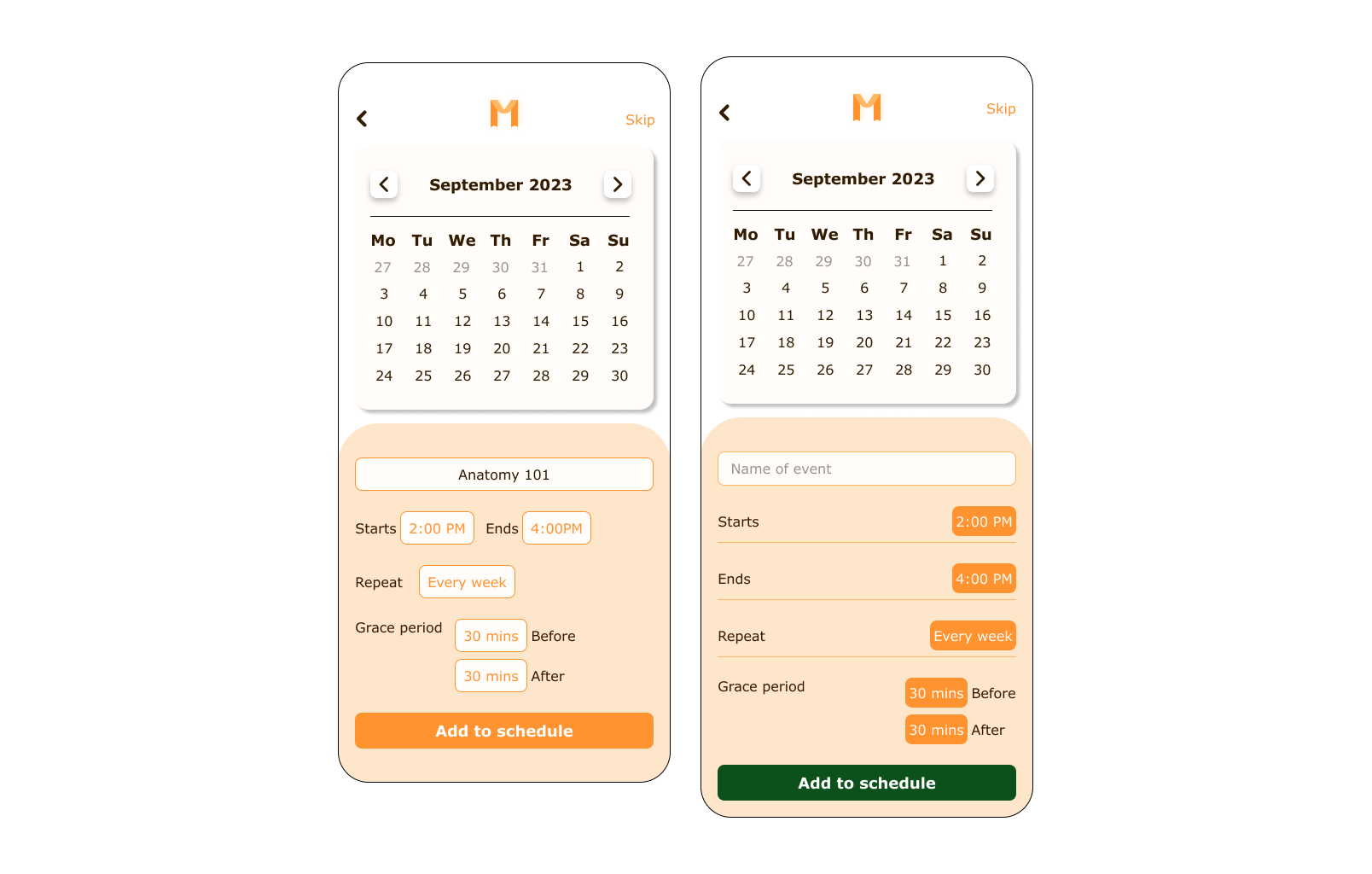

Skip-ability!
By allowing users to skip this step, we are reducing unnecessary barriers. On the other hand, some users may simply be browsing or exploring the platform and do not want to commit to creating an account right away. This flexibility can increase the chances of users returning to the platform in the future.
Final Hi-fi Prototype after Iterations

Introducing Memit
The Final Design

Onboarding Process
We understand the importance of a seamless onboarding process for our users. That's why we've designed our onboarding process to be incredibly easy and user-friendly. From the moment you sign up, our intuitive platform guides you through every step, ensuring a smooth transition into our community. We provide clear instructions and informative tooltips to help you navigate the various features and functionalities. Easy breezy.
Folder & Flashcard Creation
Organizing everything in a folder can be incredibly beneficial, whether it's for work, school, or personal projects. By creating a folder, you can neatly categorize and store all relevant notes and flashcards ensuring that everything is easily accessible and well-structured. Each flashcards provide users with a don’t know, guessed, or I got it card to prioritize users with concepts that are harder for them to grasp. This way, there are no weak links!

Next steps
Future features
Account Page
Notes Page
Settings Page
Due to time constraints, I was unable to create the account page. However, we see a glimpse of the account page as the account page provides users with the ability to edit their schedule and to see their streak progress. On the other hand, the notes page and settings page were not part of the MVP of this case study; thus, left for future features to be added.
Reflection
I am so happy but regretful that I designed an app that I wish were available during my time as a student! Anyways, here are some thoughts when designing Memit:
🔗Challenges: Time was the biggest factor which is ironic, considering the app’s emphasis on accountability and time management. I spent most of my time considering what is necessary for an accountability app because there are already so many habit tracking apps. “But why don’t they work?” I imagined that for an app to account for responsibility, there must be a way to prevent users from feeling solitude.
✍ Learnings: Cohesion! There were many parts of my hi-fi prototype that didn’t quite fit well together. This is when I learned that taking a break away from designing was helpful. It brought a fresh pair of eyes that could detect the little details I wouldn’t have before. Moreover, I get a break (☕ time).
💡Opportunities: There are definitely a lot more features available to add such as the features listed above. I will return to this case study on my free time.
⏪ Looking back: I designed this project with me as the user intended because I wanted a simple flashcard app back. Now, with advanced technology like AI, things become more complicated. There are now new flashcard apps like Knowt, who has gained recently been gaining traction. If I had a chance, I would love to learn from Knowt and how I can improve upon my designs for better user experience.